
What is the correct amount of text for worship lyric slides?
This is a topic that we see come up often as we’re helping churches improve the look of their screen visuals. In most cases, the CMG recommended amount is 2-4 lines of text on each lyric slide. However, we thought it would be a lot of fun to see what churches were actually using in their services.
We recently took a poll in our Facebook Group to see which of the following examples most closely resembled the look of the lyric slides churches used in their worship services. See the results below.
Love these backgrounds? You can get them in the February 2018 CMG Pack.


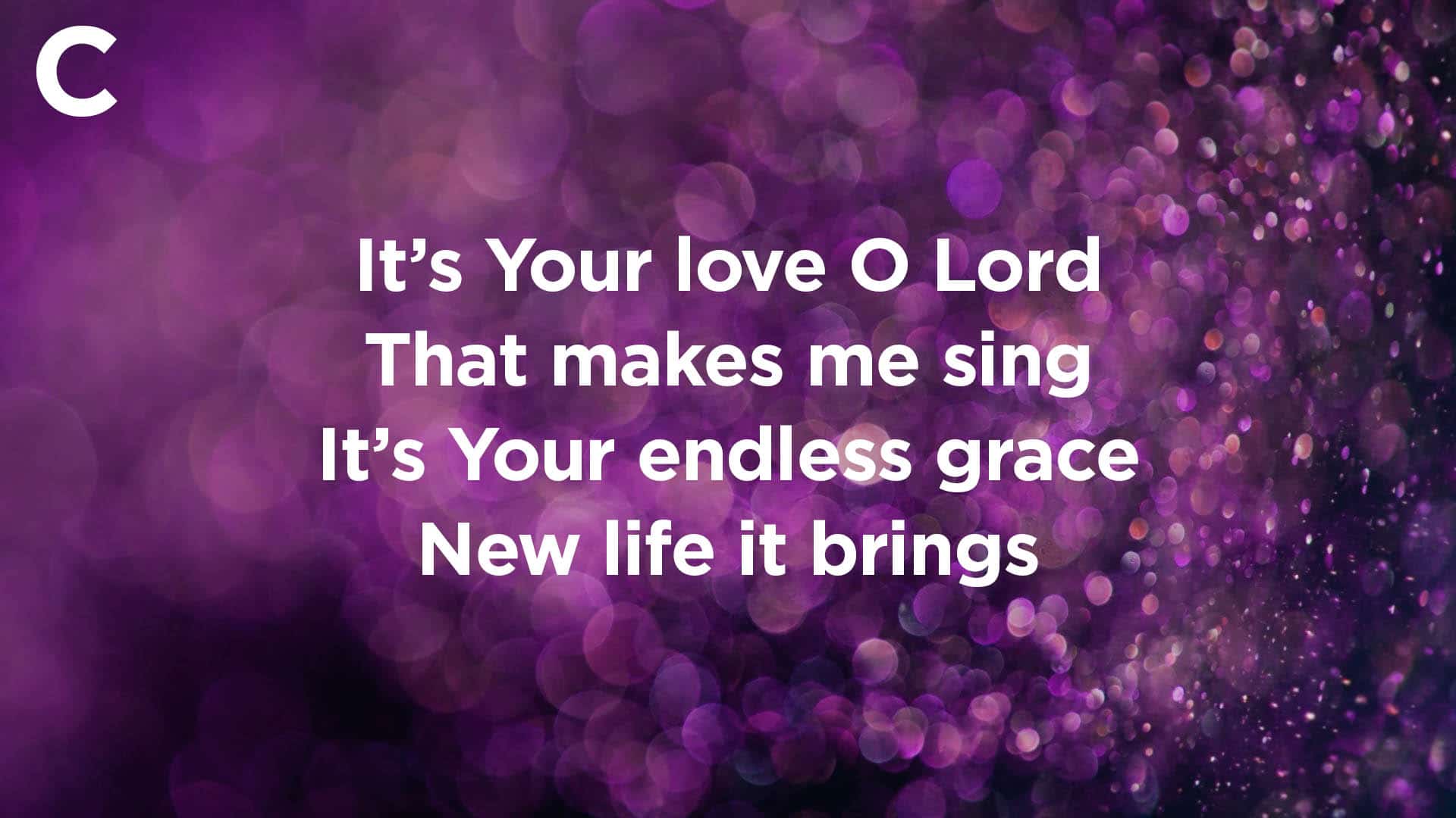
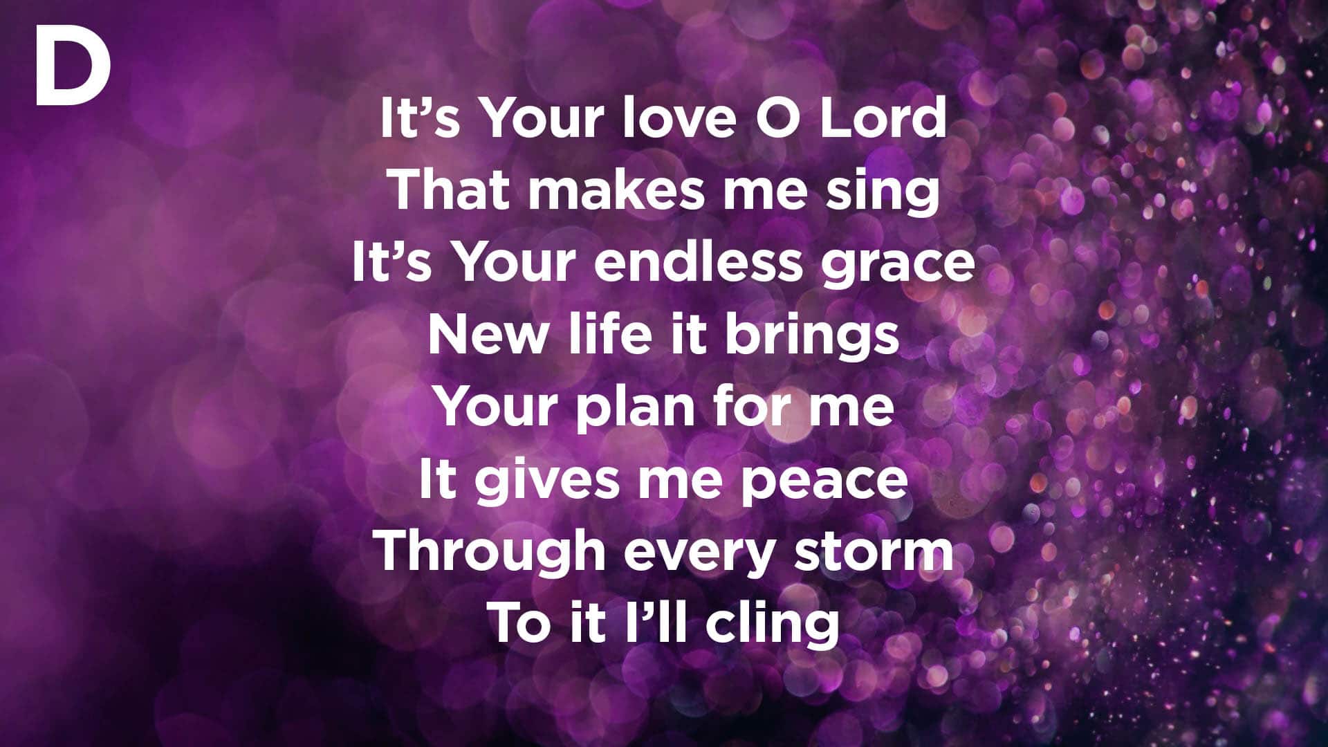
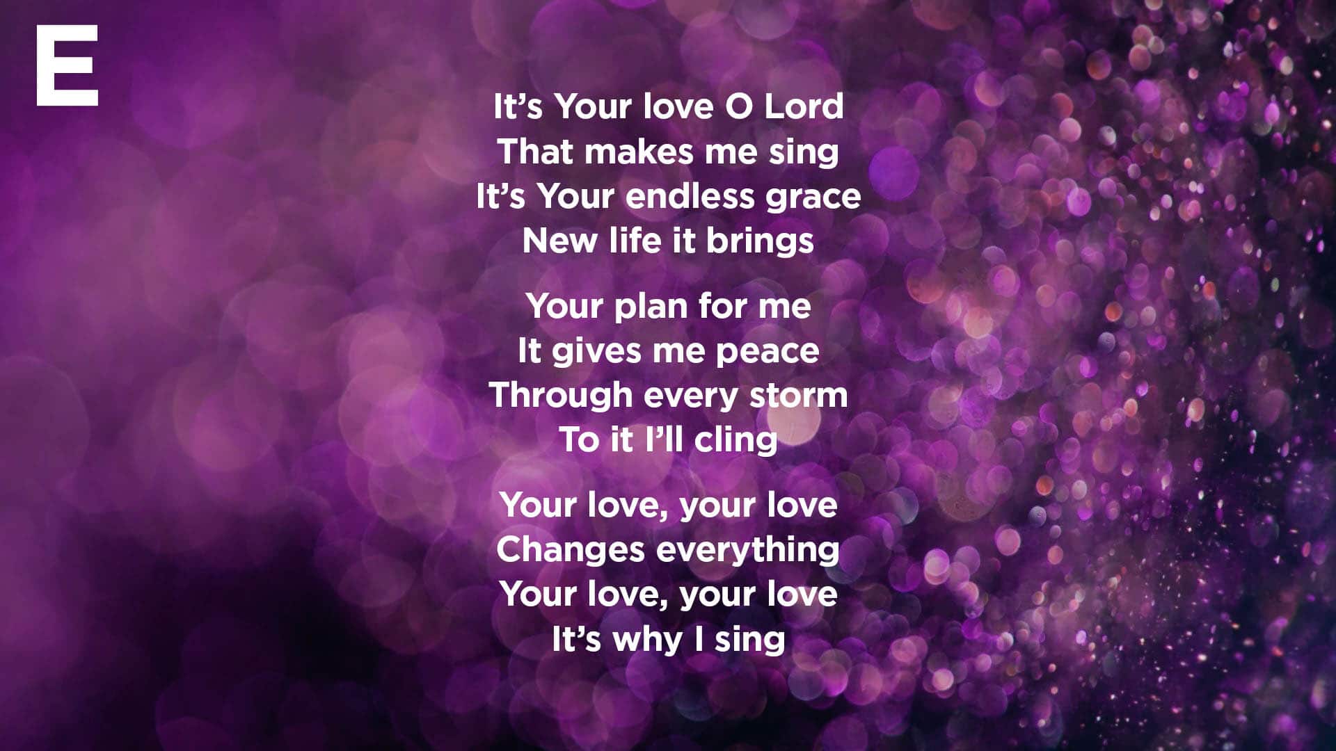 Over 1000 different churches submitted responses to this poll on what their slides typically look like week to week. After calculating the results, we were excited to see that the majority of these ministries aligned with our recommended amount of text for slides.
Official Poll Results
Option A: 11%
Option B: 43%
Option C: 34%
Option D: 9%
Option E: 3%
Top Trends
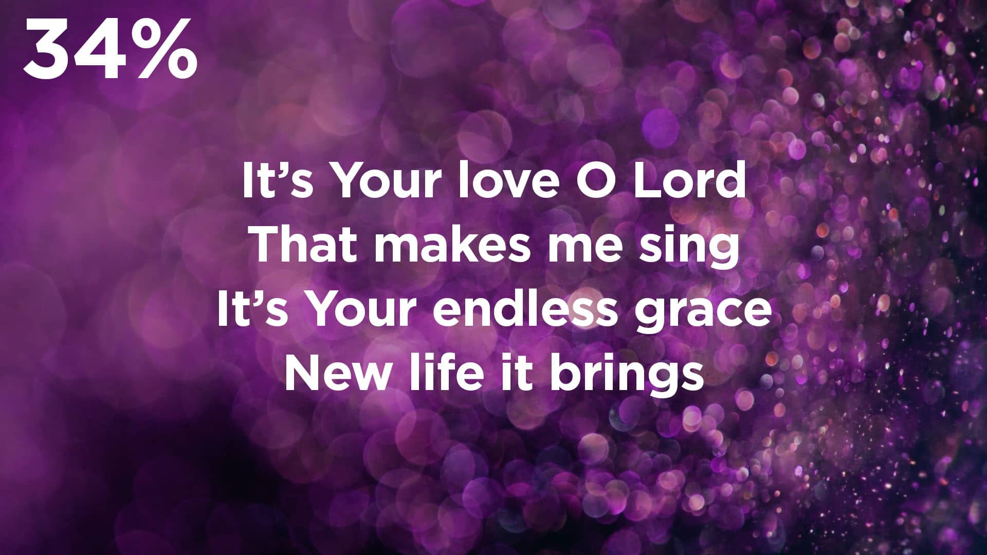
Like the majority of these churches, we recommend keeping your lyric slides at a clean 2-4 lines of text in most cases. This gives your audience enough text to follow along comfortably without displaying so much text that it’s hard to find your place.

 Love these backgrounds? You can get them in the February 2018 CMG Pack.
What Do You Think?
Which of these styles most closely resembles what you’re doing in your church? Would you consider changing with the trend? Leave a comment below and let us know!


