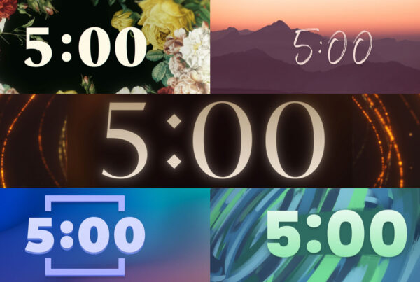
On rare or special occasions you may want to use a unique font to make your text stand out or carry a message. For example, a script, handwritten or ancient-looking font can add a sense that something is sophisticated, authentic or from the past. When choosing decorative fonts, pick one that is heavier in weight so it stands out well on your screen.
The same rules apply to decorative fonts as to sans serif and serif fonts. Always be intentional about the fonts you choose. Use decorative fonts sparingly and test to make sure they look good when projected on your screens. Decorative fonts can be used to establish many different moods such as raw, natural, playful, serious, intimate or powerful. Stick to using only one or two decorative fonts throughout your presentation and get a designer’s opinion on each one.
Fonts you should never use because they are cliché, overused and unoriginal are:
- Bleeding Cowboys
- Brush Script
- Comic Sans
- Copperplate
- Courier
- Impact
- Papyrus
- Zapfino
Instead use these decorative fonts:
To learn more worship lyric projection best practices read The Worship Media Handbook.


