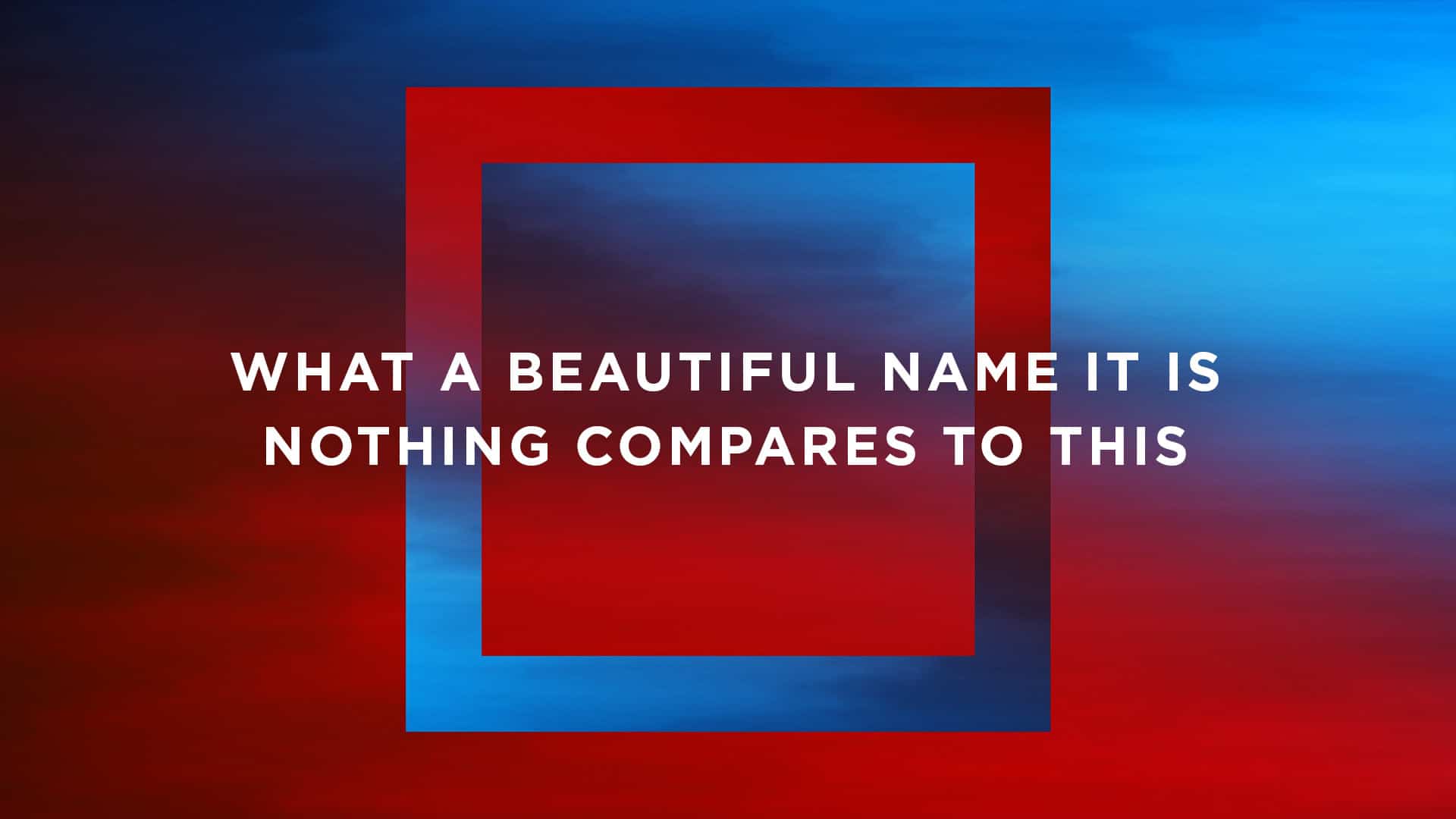
Integrating shapes in your worship lyric slides is a great way to add a splash of creativity to the normal plain text. In the January 2018 CMG Pack, we have built in several shapes right on the motion backgrounds to make it even easier to implement this popular look.
Since this is a relatively new style, we thought it would be helpful to provide a basic guide for how to use these unique backgrounds with your worship lyrics. The good news? It’s super simple!
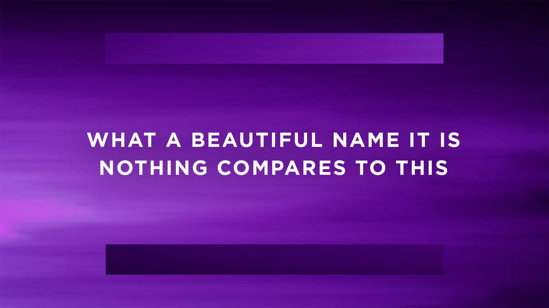 Background From The January 2018 CMG Pack (Font: Montserrat)
1. Center The Text On Your Slide
Though it can be tempting to treat these shapes as foreground elements that your text should be shaped around, we’ve found that this style looks best when your text is centered vertically and horizontally over the shapes.
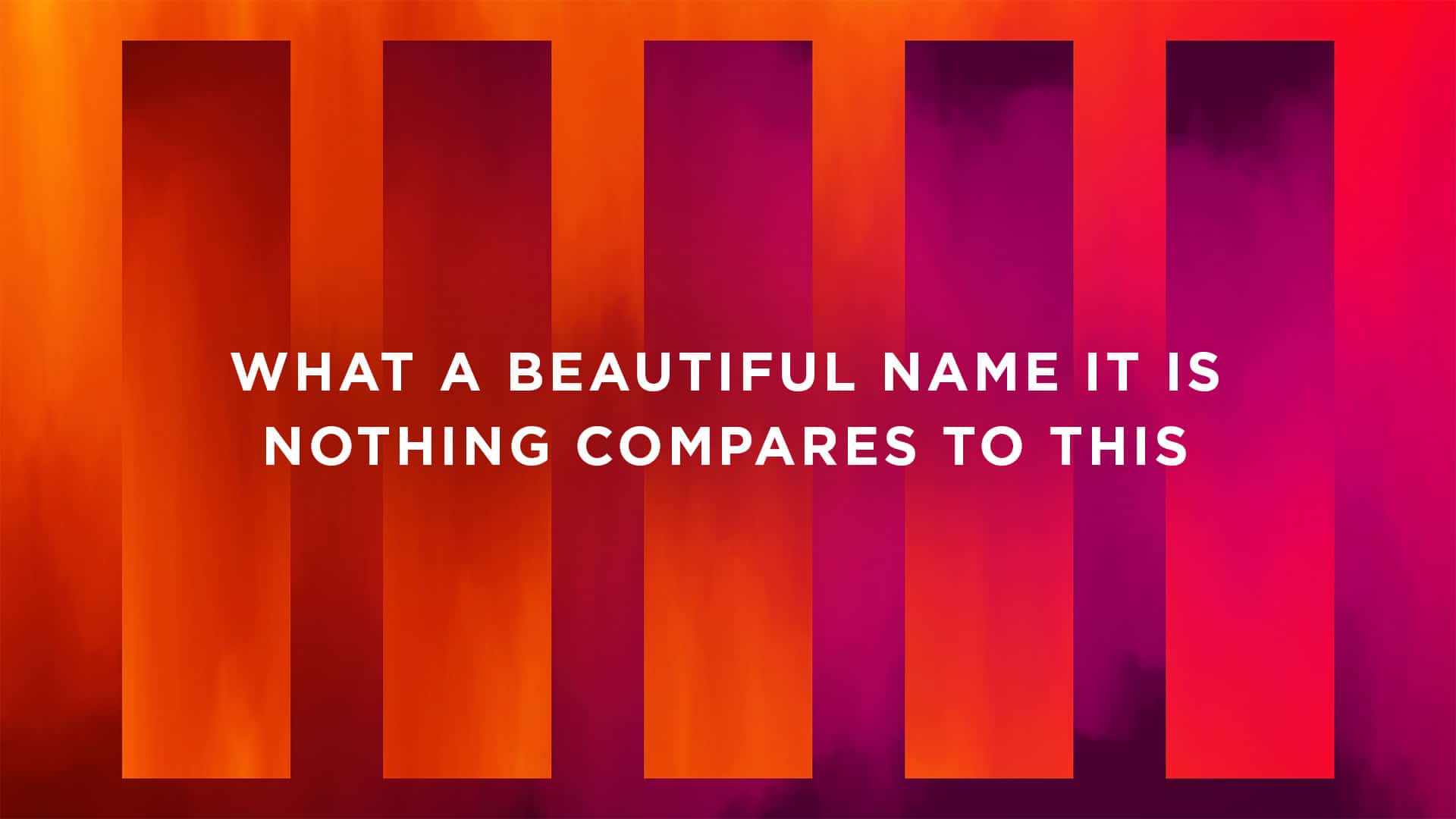 Background From The January 2018 CMG Pack (Font: Montserrat)
2. Stick To 1-2 Lines Of Text
Many times, your text will fit right inside the shapes in these backgrounds. We recommend using 1-2 lines of texts per slide with a rare maximum of 3 lines. This keeps your slides clean and looks best with this creative style.
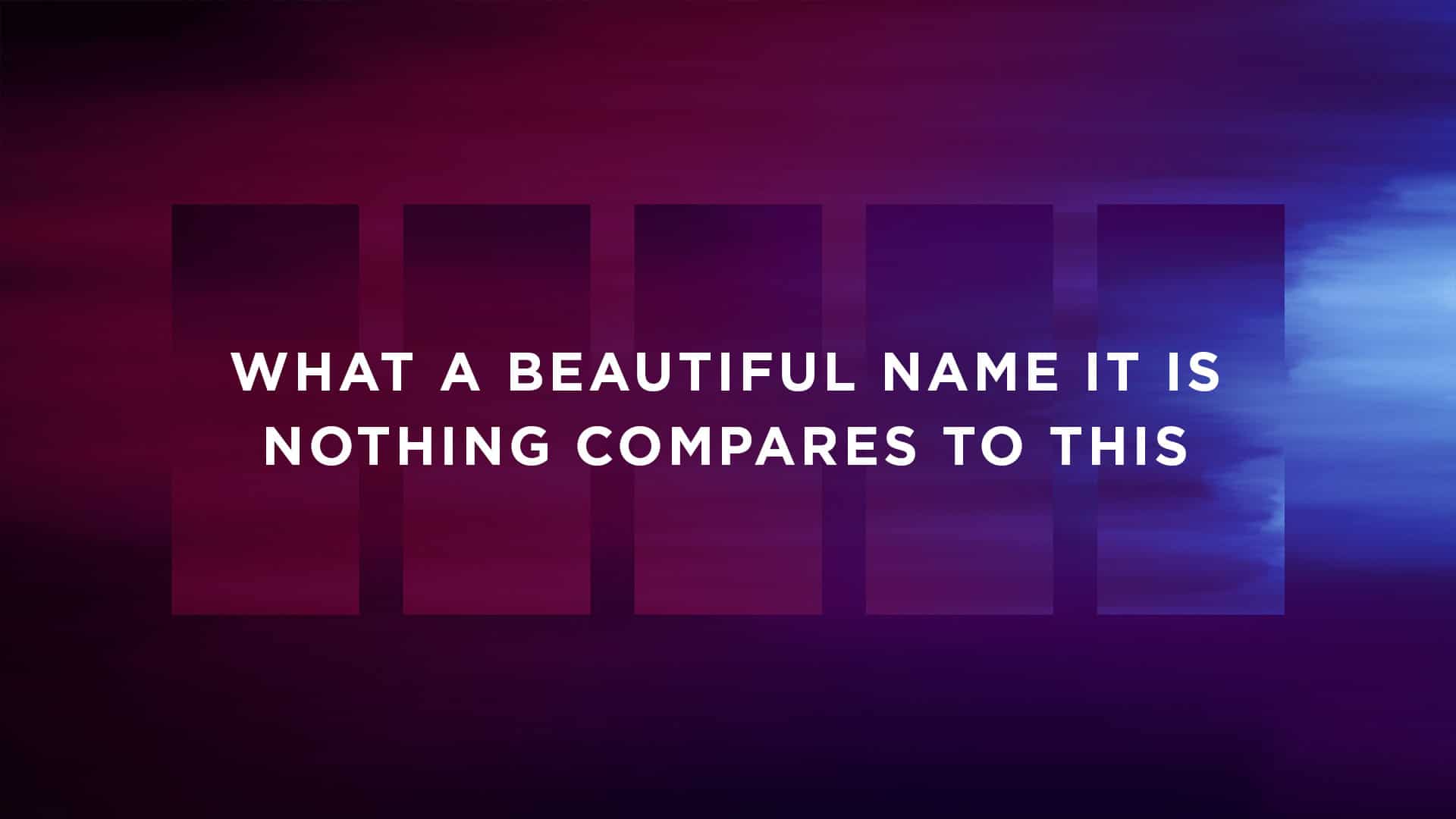 Background From The January 2018 CMG Pack (Font: Montserrat)
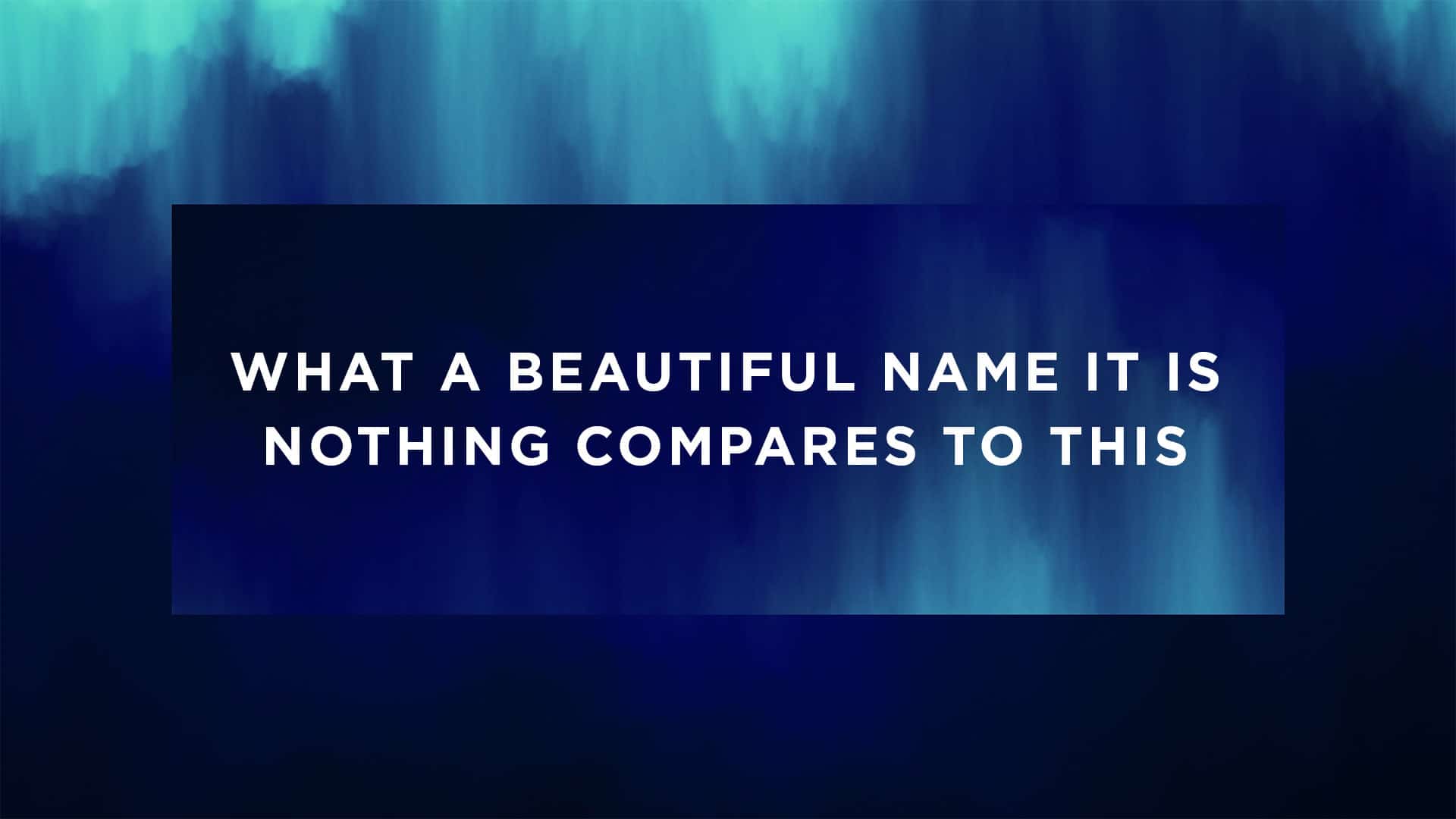 Background From The January 2018 CMG Pack (Font: Montserrat)
3. Don’t Be Confined To The Shape
With more unique shapes, your text shouldn’t be confined to stay inside these boundaries. Instead, they should simply overlay the shape as they normally would be laid out on your slides.
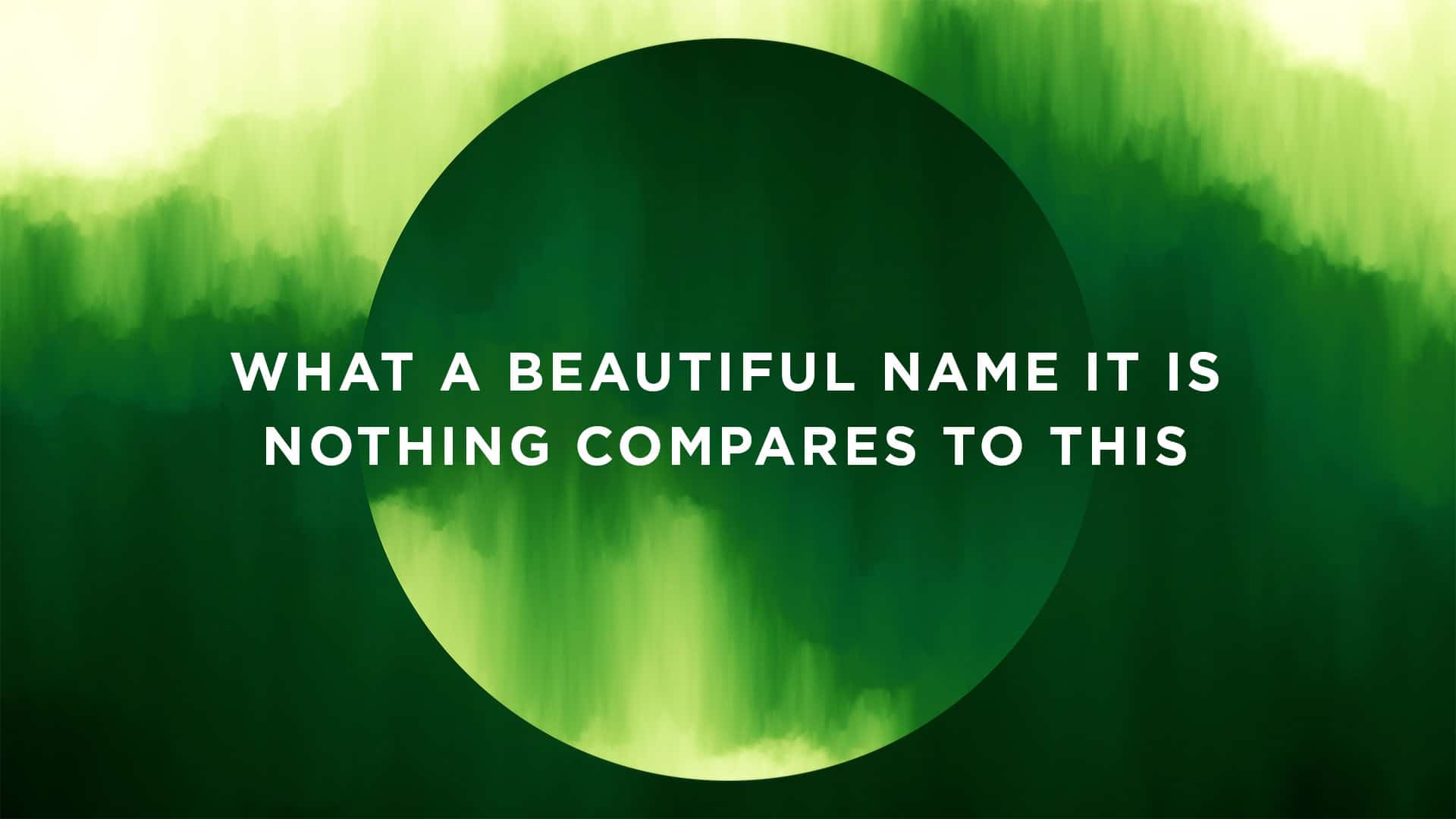 Background From The January 2018 CMG Pack (Font: Montserrat)
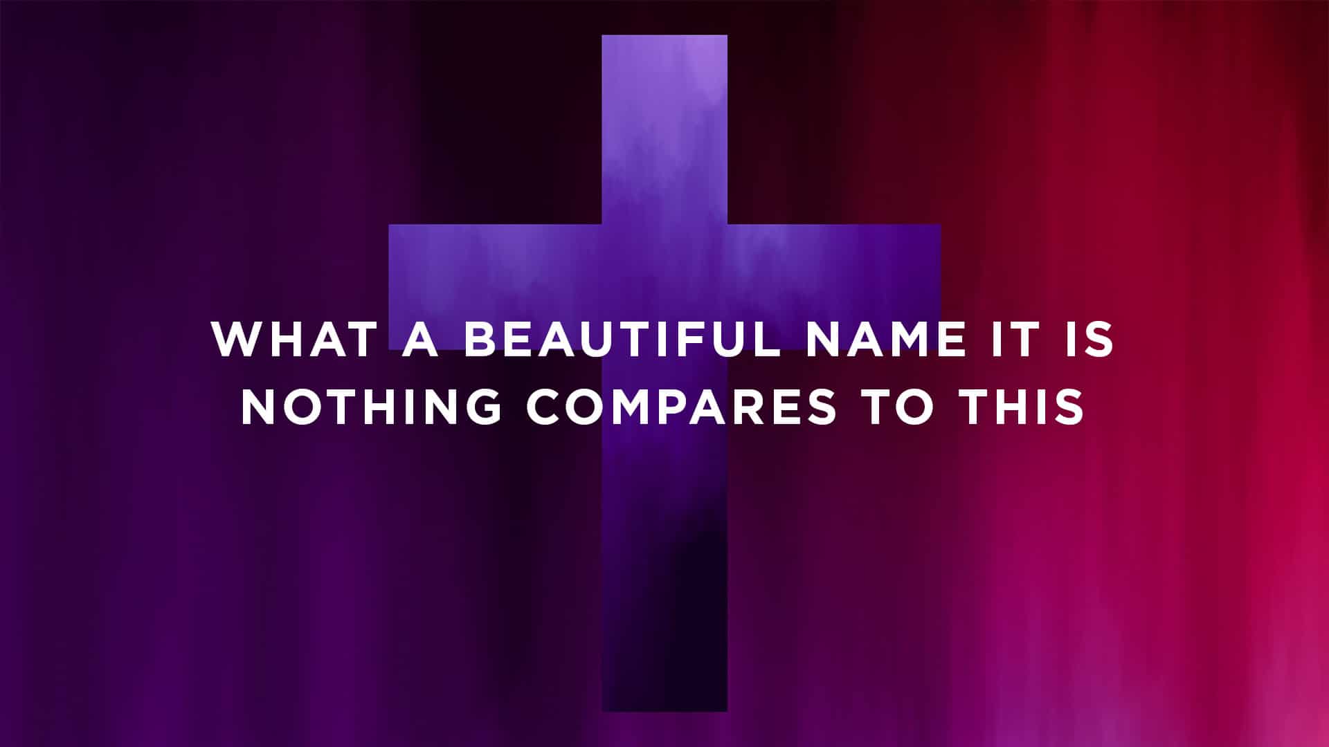 Background From The January 2018 CMG Pack (Font: Montserrat)

