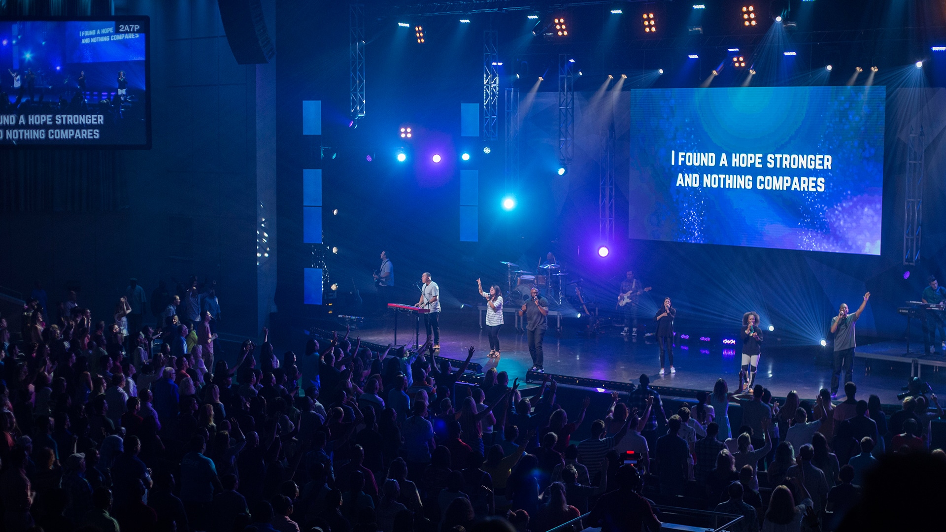
Picking the perfect font size for displaying lyrics in your worship space can be challenging. Because each environment and screen are different, there is no easy, go-to answer that applies to all churches. However, there are some principles that will set you up for success.
The key to choosing the right font size is to avoid going so small that your audience cannot read it, while not going so large that it breaks up the lyrics in unnatural places. It’s all about finding that happy medium where your audience can easily read the lyrics in a flow that feels natural to the song.
Ideally, you want to choose a size that is easily legible when viewed from any area of your room.
Some other key points to consider when choosing your font size are:
- Find the smallest font size that is comfortably legible from the back of your room. There is no need to use oversized text if not completely necessary. A large type is overpowering and gives the impression that you are yelling at your community.
- It is preferable to have more of the background (or negative space) showing than to fill the whole screen with text. Use those backgrounds for all they’re worth!
- Too small of a font can lead to less crowd participation. When a word is small and difficult to read, the human mind perceives it as less important.
It cannot be stressed enough to keep a consistent font size throughout your presentation and especially within one song. As you switch between slides, the size of your text should remain the same. Using different font sizes can break the visual consistency.
The environment in which you are projecting will also have an influence on the font size you choose. For example, a long narrow room with small screens will require a larger font, while a cinema theater with large screens in a relatively shallow space will require a smaller font.
When Working With Small Screens
If your environment has an undersized screen in relation to your room size, such as a TV, you might have a problem with your text being too small.
A few ideas to help allow for larger text are:
- Break up lines of text at natural points and put less text on the screen at a time
- Decrease the tracking (letter-spacing) of your text
- Use a narrower font
Use CMG Sans Bold Condensed Font


