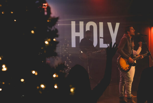
Fonts come in a wide range of styles all with varying degrees of emotion. When projecting lyrics it is common practice to use fonts that carry little to no emotion. This is desirable because you want your type to merely be a conduit for your messages. Only on occasion will you want the style of your type to carry a message itself.
If your presentation uses more than two fonts then you have used too many. Do not use more than two fonts throughout your entire presentation. This will keep things looking clean, professional and cohesive. Fonts are loners by nature. Don’t make them upset by forcing them to play together.
Readability trumps style. Never sacrifice the readability of your text or lyrics because of an artistic or creative choice. If what you are trying to communicate is unreadable then your message will be lost. Establish a default font that is readable and then introduce other design elements to add meaning and emotion.
Sans Serif Fonts
The default font on every Mac and PC computer is Helvetica or Arial which are both sans serif fonts. The name “sans serif” literally means “without serif”, which is any protruding feature at the end of a stroke. Without serifs, a piece of text will have a simpler-looking form compared to a piece of text with serifs.
Some primary features of sans serif typefaces that make them the most popular typeface for worship lyric projection are:
- Clean and modern looking
- Easy to read
- Interlaced video friendly
- Less fine details
- Less line width variation than serif fonts
- Look great projected onto video screens
Sans serif fonts are a safe choice for almost any worship lyric presentation. They will complement today’s worship songs with their clean lines, smooth edges and geometric shapes.
Popular sans serif fonts that are being used in many churches today are:
- Gill Sans
- Gotham
- Helvetica Neue
- Myriad Pro
- Tahoma
- Verdana
Serif Fonts
Serif fonts are commonly used in book publishing because serifs help guide a reader’s eye along lengthy blocks of text. Worship lyric projection does not use large blocks of text, so serif fonts are unnecessary and therefore less commonly used. Save using serif fonts for projecting lengthy passages of scripture or quotes. Also try using a serif font as a stylistic choice for headings or titles if it fits your design theme.
Some points to consider when choosing a serif font are:
- Flickering of serifs can occur on interlaced video
- Looks more traditional
- More helpful for long blocks of text
- Serifs can become lost or blurry on low resolution projectors
- Serifs help guide the eye from letter to letter and word to word
Popular serif fonts that you may find useful when designing your worship presentations are:
- Baskerville
- Bodoni
- Chaparral Pro
- Clarendon
- Garamond
To learn more worship lyric projection best practices read The Worship Media Handbook.


