Great sermon slides can have a huge impact on your audience. On the other hand, poorly designed slides can leave your audience confused or distracted from what you’re trying to communicate. Don’t worry – we’re here to help with a few tips to guarantee that your presentation looks great and improves your message.
1. Use An Attention-Grabbing Title Graphic
Set up your presentation for success by using a well-designed graphic for your message or series. People are more likely to remember a specific sermon when they can put an image to it. Use this same graphic on all of your materials such as invite cards, social media posts, etc. It will capture peoples’ attention and they’ll more likely to attend because the topic stands out to them. Need some help? Church Motion Graphics has a large collection of sermon templates.
2. Display Key Points, Not Full Sentences
Because the message is important to you, it can be tempting to put too much of the message on your slides. Instead, only give your audience key points to remember throughout your sermon. This will help the audience remember the most important moments that will provide the most value. It also makes it easy for them to share about the message on social media.
 3. Use Photos When Telling Stories
You’ve heard it said that “a picture is worth a thousand words.” Using photos or illustrations in your sermon presentations is a great way to increase engagement and overall understanding of what you’re communicating. The right image combined with meaningful teaching can leave a lasting impression on your audience.
 4. Only Show 1-2 Bible Verses Per Slide
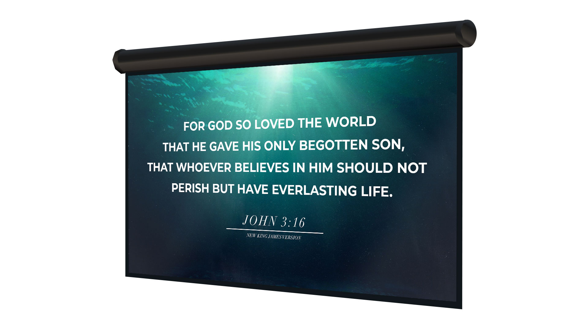
Since a lot of your audience won’t have a Bible with them, it can be helpful to display every verse that you read on your screens. Just like when you are displaying lyrics, you only want to display a few lines of text at a time. Don’t overload your slides with too much text just to fit an entire passage. It’s better to span a verse across multiple slides.

We’re Here To Help You Look Great
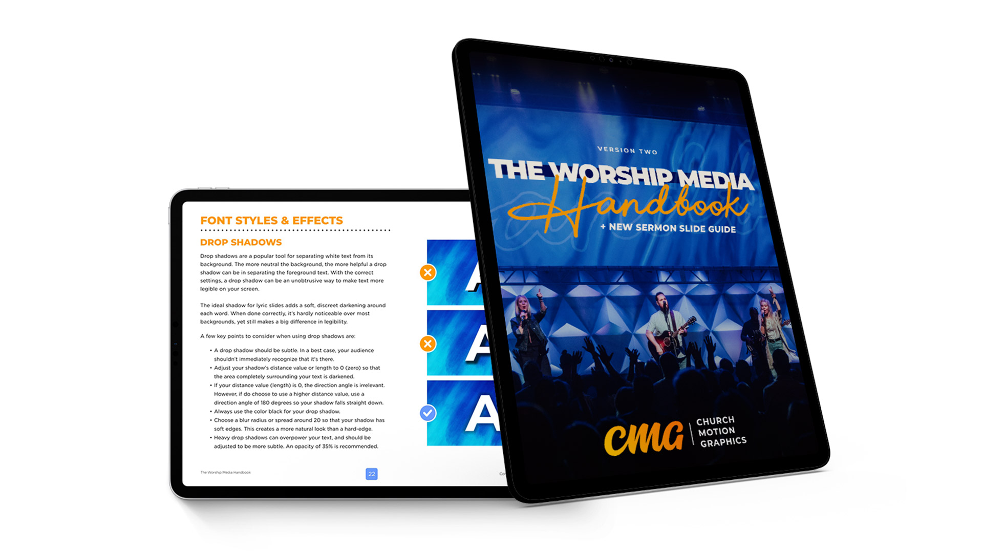
 It can be difficult to design high-quality sermon slides. At Church Motion Graphics, we have made this one easy. We just released Version 2 of The Worship Media Handbook with an entire new section dedicated to creating sermon slides. This 104-page PDF ebook is freshly updated for 2019, and will quickly train you and your church media team on how to prepare, edit and present sermon slides with excellence.


