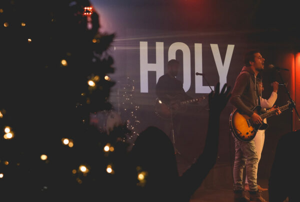
Lyric slides, also known as worship slides, are an extremely valuable part of the modern church experience. They enable regular attendees and newcomers alike to comfortably sing along with the band as they lead in moments of praise.
After many years of churches using generic styles as the norm, some truly creative looks for these slides have begun to gain popularity. In addition to motion backgrounds, these styles have included using boxes, lines, circles, and even creative fonts to add extra flair.
 Background From The August 2017 CMG Pack
 Background From The August 2017 CMG Pack
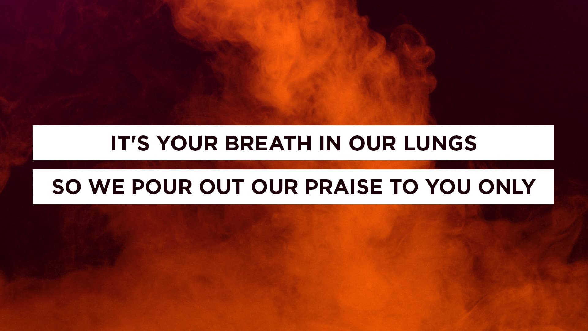 Background From The August 2017 CMG Pack
These examples are all styles created by our designers, so we love these looks. However, we do encourage discretion as you’re designing your own lyric slides. Whether you’re adding shapes, new fonts, or simply adjusting the amount of lines on your slides, remember this important rule:
The primary function and top priority of lyric slides is to help your audience participate by providing the words to songs.
While style and creativity are important to providing a great environment for your congregation, the legibility and overall function of your lyric slides should always come first.
Would you say that you’ve followed this rule? Let us know in the comments below!
Want to get this look for your church? Download the August 2017 CMG Pack.

