
Shadows are the most popular tool for separating white text from its background. The more neutral the background, the more helpful it can be in separating the foreground text. With the correct settings, this simple effect can be an unobtrusive way to make your lyrics easy to read on nearly every background.
Our ideal shadow for lyric slides adds a soft, discreet darkening around each word. When done correctly, it’s hardly noticeable over most backgrounds, yet still makes a big difference in legibility. In the example below, you can see how it’s so subtle that it goes practically unnoticed over the green background.
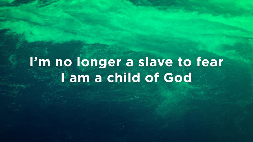
Background from the June 2017 CMG Pack
(Font: Gotham Bold)
ProPresenter
Angle: 180 degrees
Length: 0
Radius: 20
Color: #000000
Opacity: 35%
MediaShout
Color: #000000
Direction: 270 degrees
Distance: 1
Blur: 10
Shadow Opacity: 50
Proclaim
Color: #000000
Opacity: 50%
Direction: 270 degrees
Depth: 0
Spread: 20
Worship Extreme
Vertical: 0 (Completely up)
Horizontal: 0 (Completely left)
Blur: 100% (Completely right)
Color: #000000

