This week I had the opportunity to lead a workshop on color meaning to the visual production community at my church. I enjoyed sharing these important principals to the group and thought you and your community would find them helpful as well. Feel free to share this post with your team or use the information to lead your own workshop.
All Color Holds Meaning
The meaning in which color holds is from two sources. The first is from nature and the second is from culture. For example, when you think of the color green, your mind will wonder towards thoughts green grass and trees that are alive, fresh and living. The natural environment plays a leading role in how we understand color, because it is all around us and we are drawn towards it. Culture has shaped our view of color by how it is used (and abused) in our built environments. For example, when you see the colors red, white and blue together you might have patriotic thoughts if you are an American citizen.
By using color meaning to our advantage we can add depth into our visuals by picking colors that pair with the emotions and ideas we are trying to communicate. Even though color meaning is subtle, subconsciously they can turn a good design into a great design just by choosing one color over another for the job.
The Color Wheel
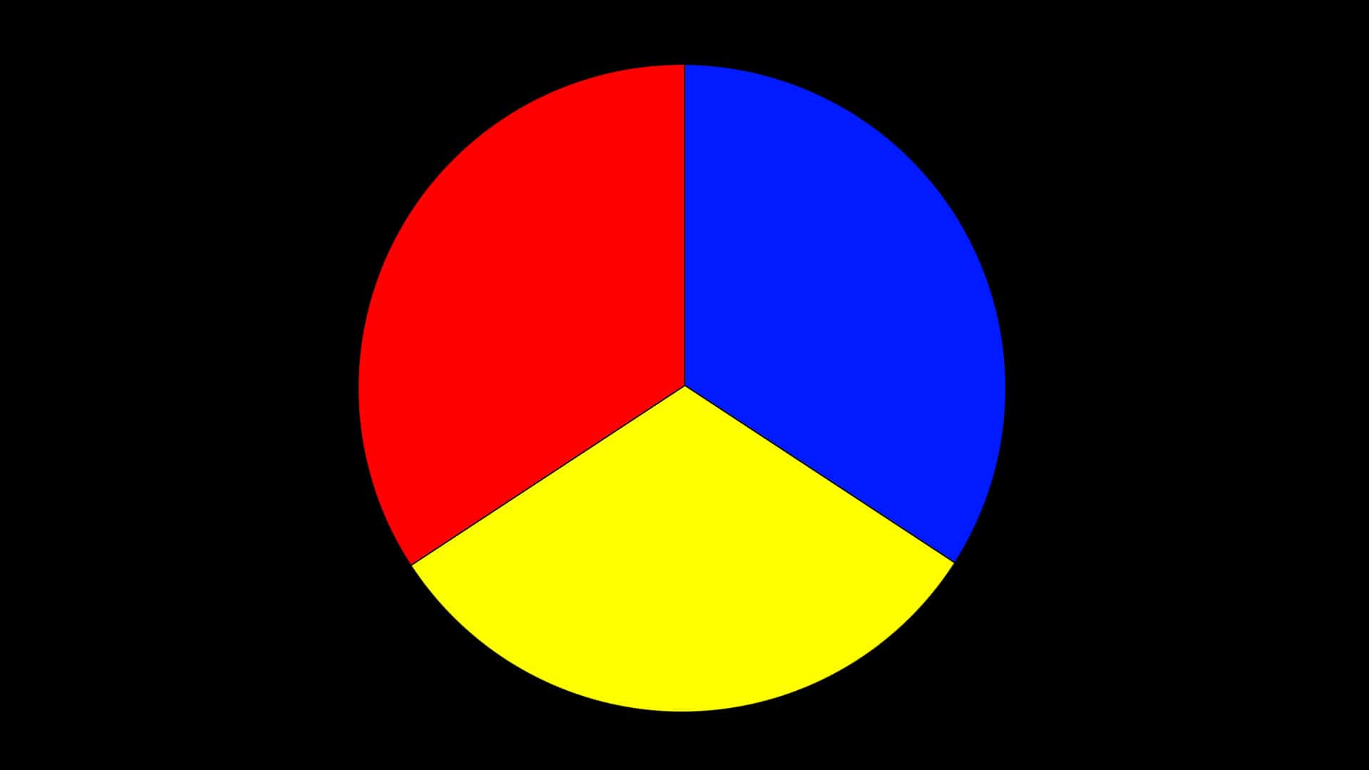
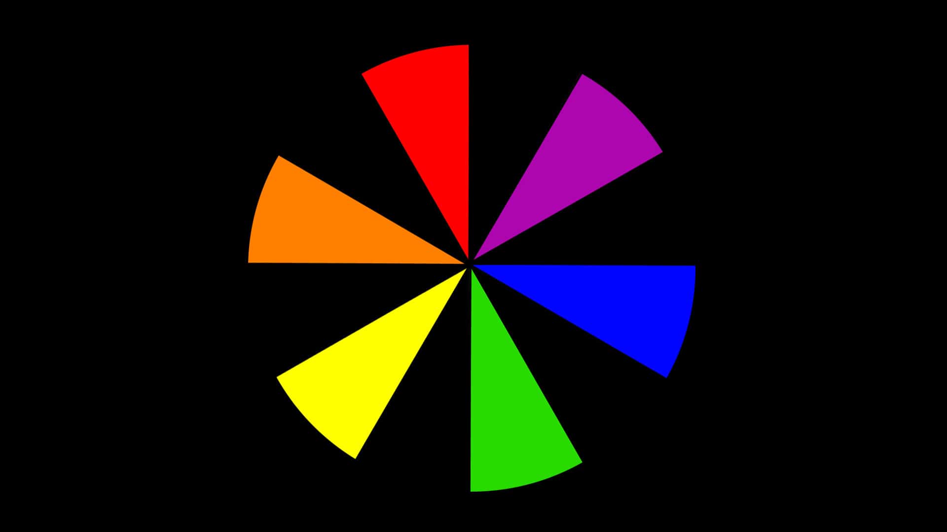
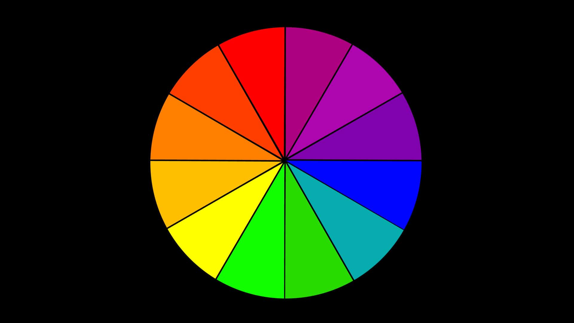
Let’s start with the basics. There are three primary colors and they are red, blue and yellow. When mixed together in pairs we get three secondary colors: green, orange and violet. Those pairs can be broken down further into intermedia colors such as orange-yellow and blue-violet, but for the sake of this color meaning study, intermedia colors are not important.
The Two Color Seasons
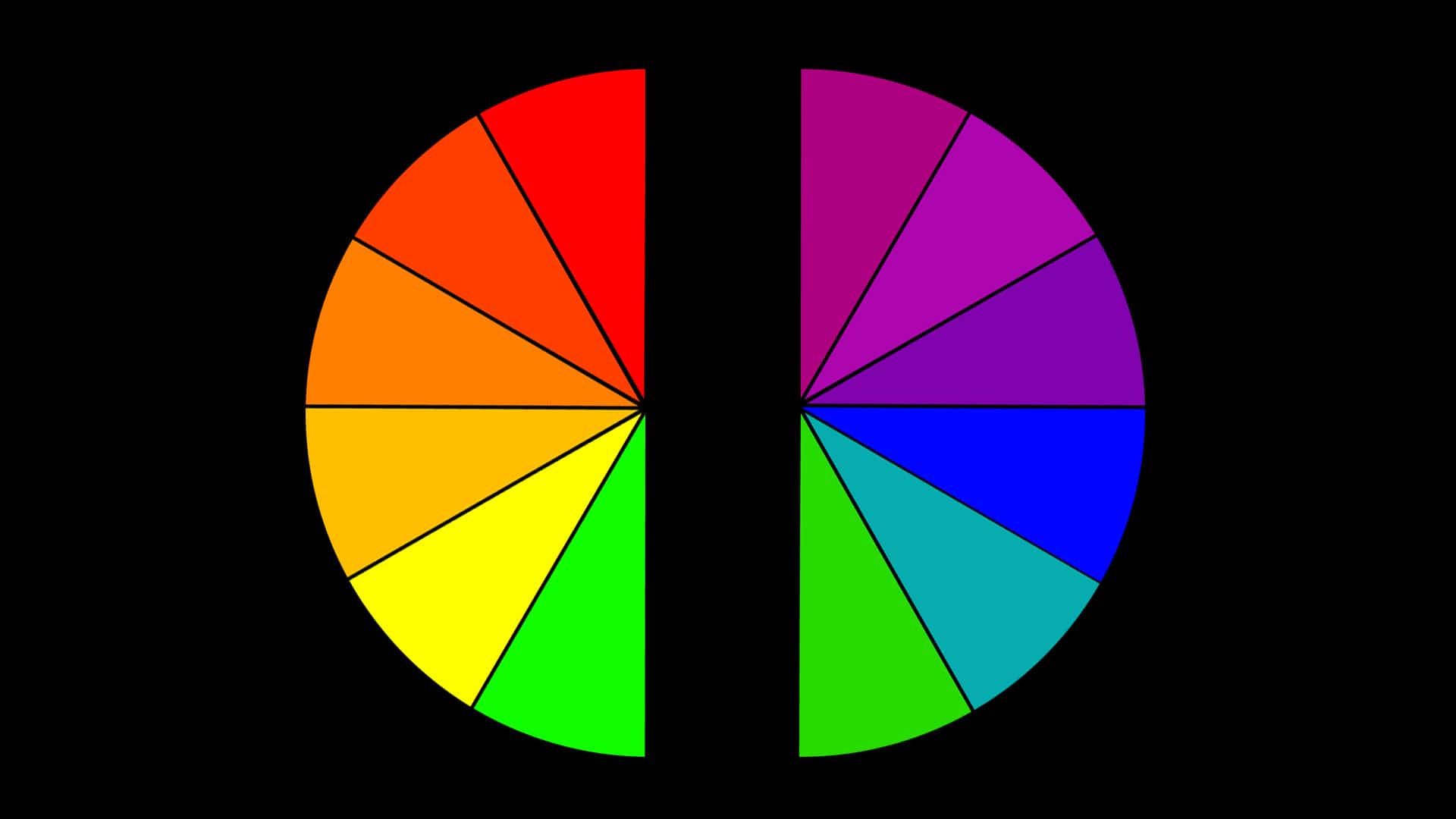
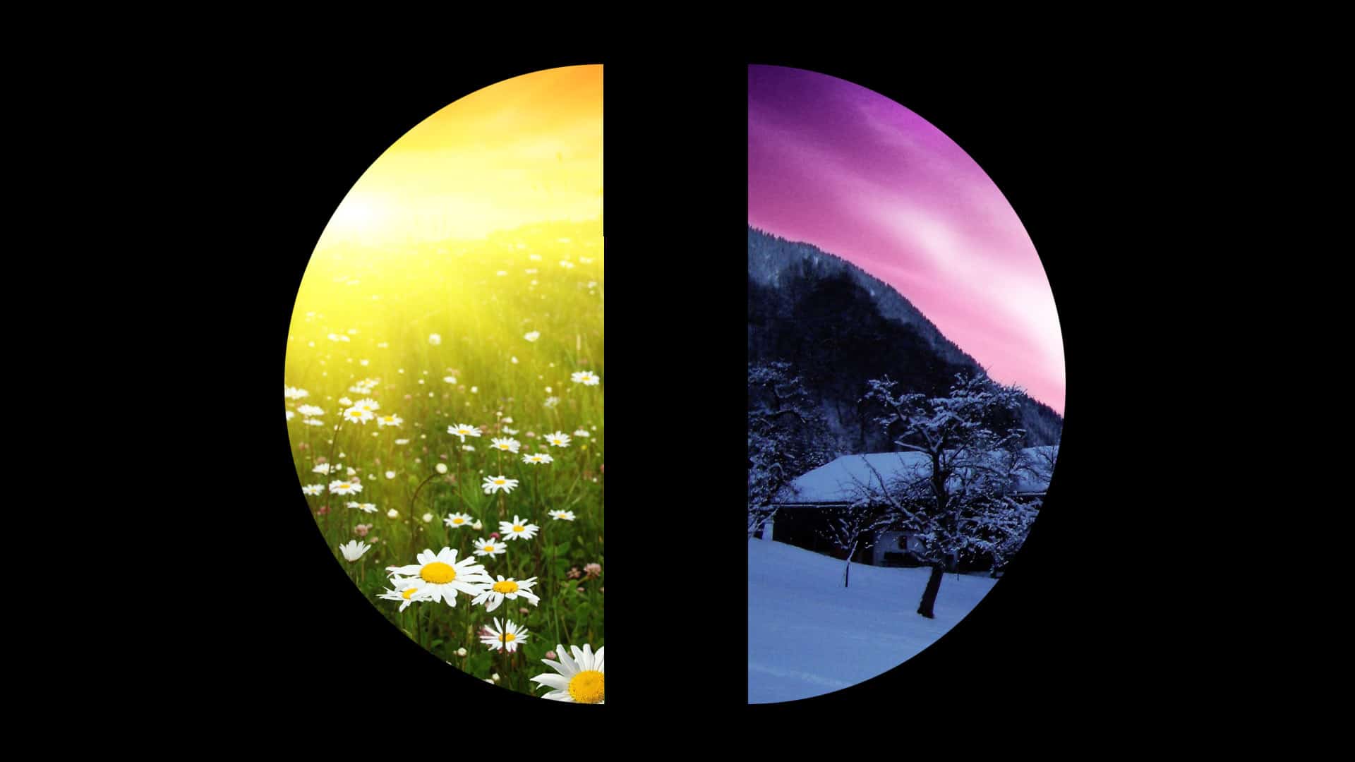
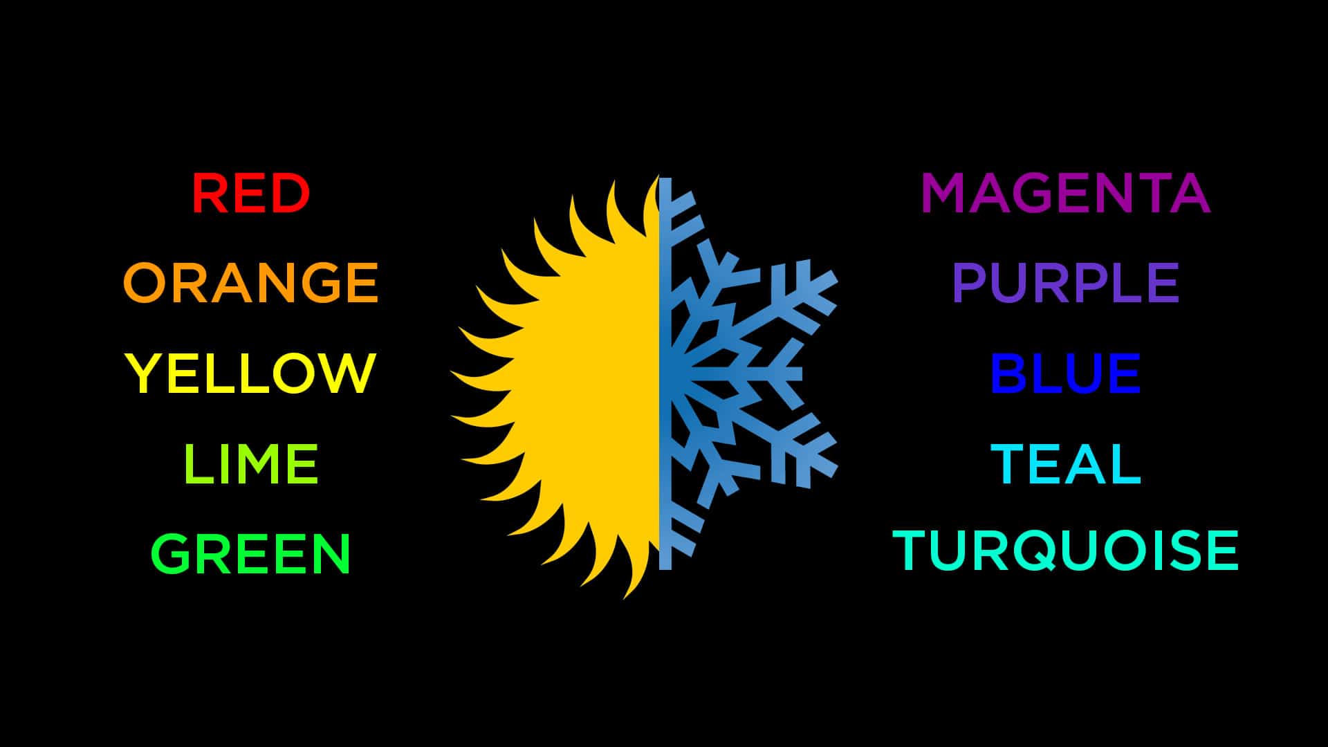
The simplest way I like to categorize the color wheel is to split it in half. On one side you have all the warm colors such as red, orange, yellow, lime and green, and the other side you have all the cool colors such as magenta, purple, blue, turquoise and teal. When first deciding on a color ask yourself if you are trying to create a warm mood or a cool mood? Warm moods are energetic, exciting, fun and alive. Cool moods are relaxing, calm, intimate and peaceful.
Individual Color Meaning
Once you have decided on a color season it’s time to choose a specific color. In my past post, “Color Meaning for Visual Worship” I run through an entire list of primary and secondary colors and highlight all their meanings. Instead of reposting those details again I will just list the top two meanings for each color.
Red: Love and energy
Orange: Joy and creativity
Yellow: Happiness and fun
Green: Fresh and life
Blue: Calming and stable
Purple: Stability and authority
Black: Focus and power
White: Purity and light
Color Meaning Examples
Commercial advertising is the perfect place to look if you want to see color meaning used to communicate focused messages. Advertisers will go to great lengths to create effective ads that invoke positive responses from it’s viewer. Every little detail of an ad is scrutinized and tested to achieve the greatest results.
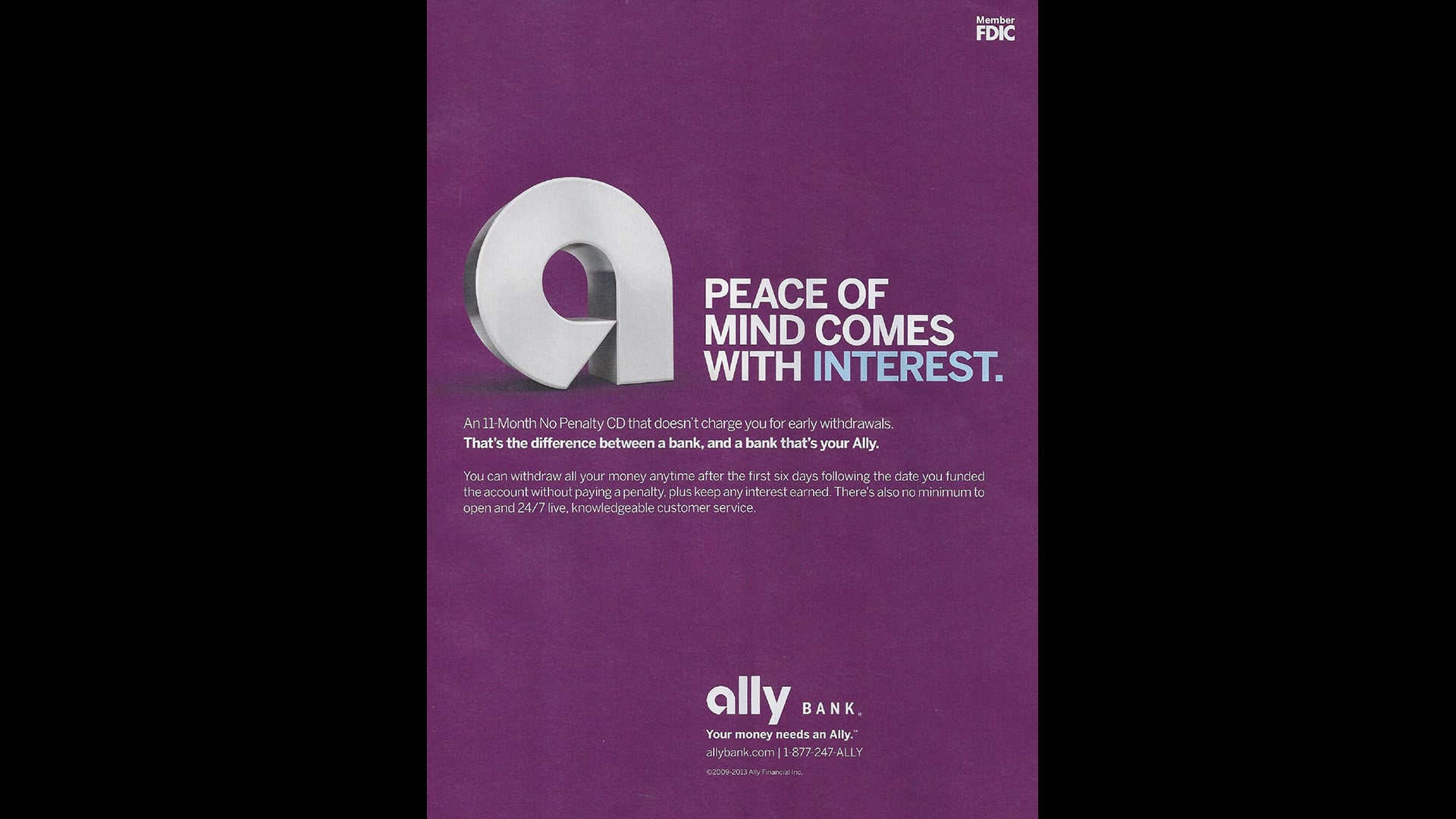
Ally Bank: Purple is used to communicate authority and stability.
Beach Vacation: Blue is used to communicate relaxation and a calming escape from your busy life.
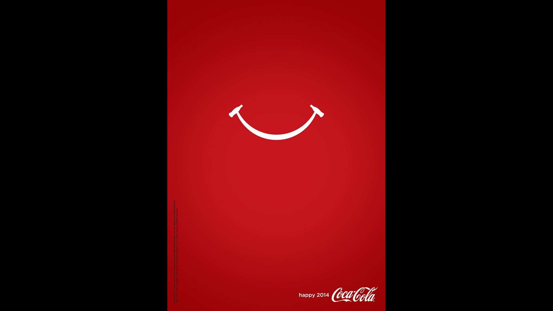
Coca-Cola: Red is used to communicate that you love drinking Coke and it makes you feel happy.
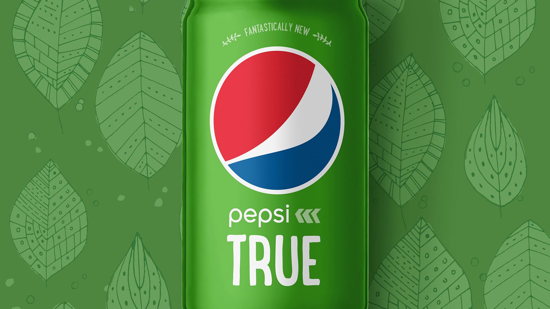
Pepsi True: Green is used to communicate that this is a fresh and healthy product.
Nike Runner: Yellow is used to communicate that this shoe will make you fast. Gold and black colors are used to communicate that this is a valuable and coveted shoe to own.
Water Bottle: White is used to communicate that this water is pure and clean.
As Christians we have the greatest news to share that Jesus is the light of the world. God has given us color as a tool to help communicate this message and we should use it to our advantage to tell deeper and more impactful stories. My challenge for you is to always use color purposefully by paralleling it’s associated meaning with your desired message.
If you found this post helpful you will enjoy reading my e-book The Worship Media Handbook.

